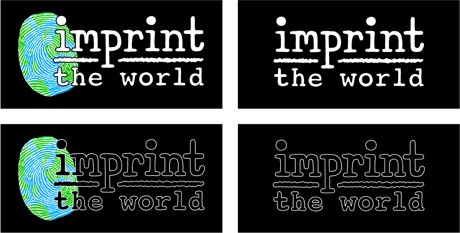
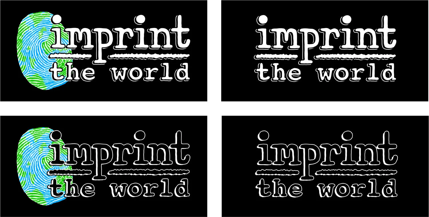
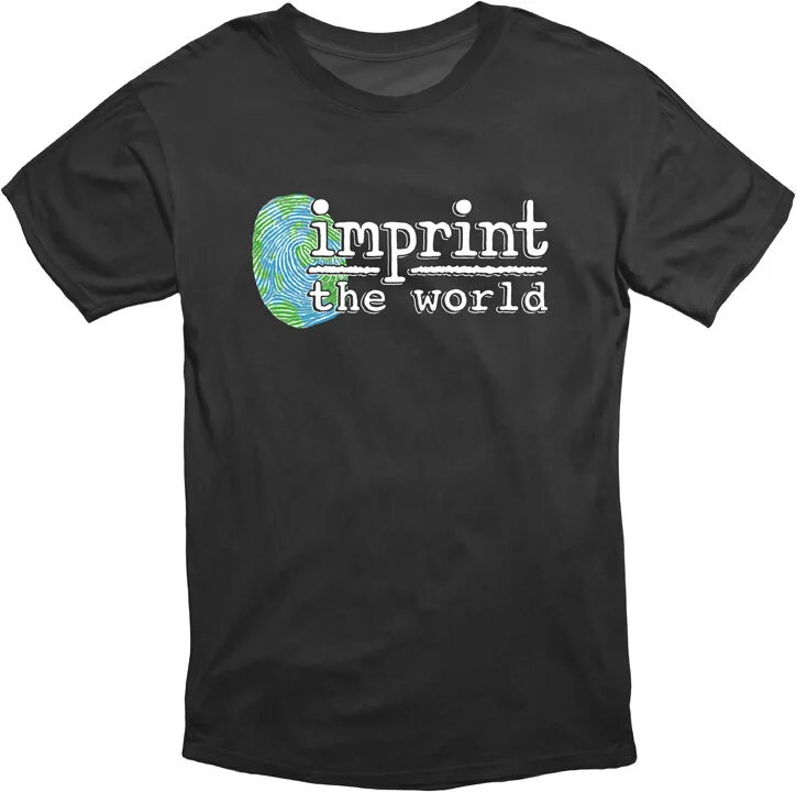
Various looks at the main logo. It works on light and dark backgrounds, and with or without the finger print globe symbol. Keeping the outlines slightly irregular gives it a human touch, which relates to the charity aspect of the organization. “imprint” was made from scratch and was based on typewriter fonts, again to give it a more personal feel to fit with the point of the organization. Straight, rigid edges made it feel stiff and computerized, detaching it from the human element. ‘the world’ is a modified version of the courier typeface, edited to give it a more irregular feel. The horizontal center line was kept more jagged to relate to the look of the lines of a finger print. The vertical line of the ‘p’ was pushed below the horizontal center divider to connect the top and bottom.
Programs used: Procreate, Adobe Illustrator, and Photoshop.
Click to view the other assets…..


